Improving the Visitors’ Experience of the Stephen A. Schwarzman Building
Opportunity Statement
The entry and entire journey through the library is unclear and disorganized for all visitors.
When we first did our research on the library, we found opportunity in improving the entry experience of the library. But upon our visit, we discovered that they entry and actually the entire journey through the library isn’t structured or clear for users. Therefore, unfortunately… people don’t or can’t understand the library’s offerings.
Mission Statement
Our mission is to promote the library as a premier cultural institution by elevating the visitor experience and aligning this experience with it’s reputation.
We set out on a mission to elevate the visitor experience, promoting the library as a premier cultural institution and aligning the physical experience with the mental image of it's reputation.
Research
We visited the library and examined the current system.
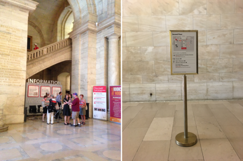
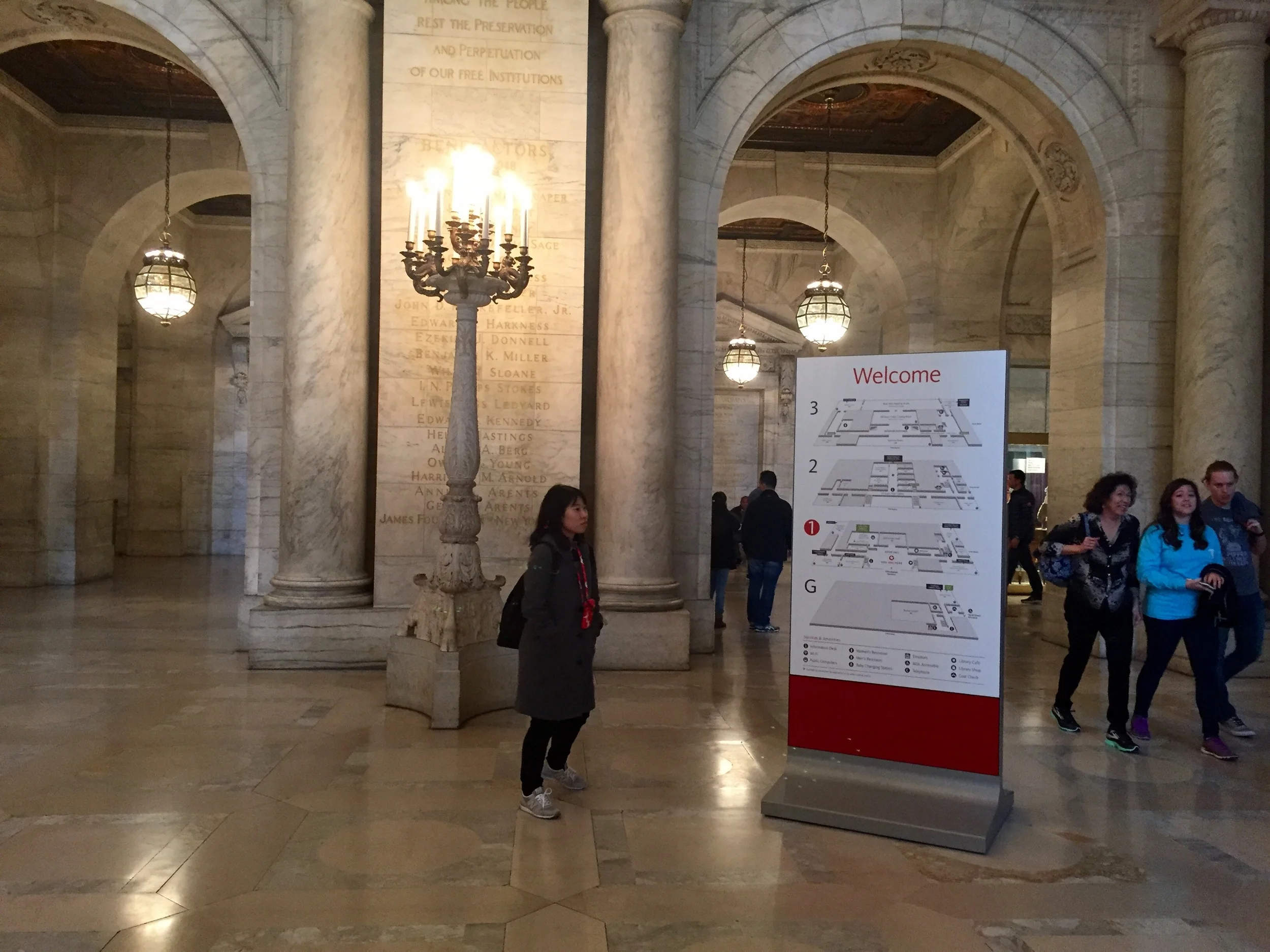
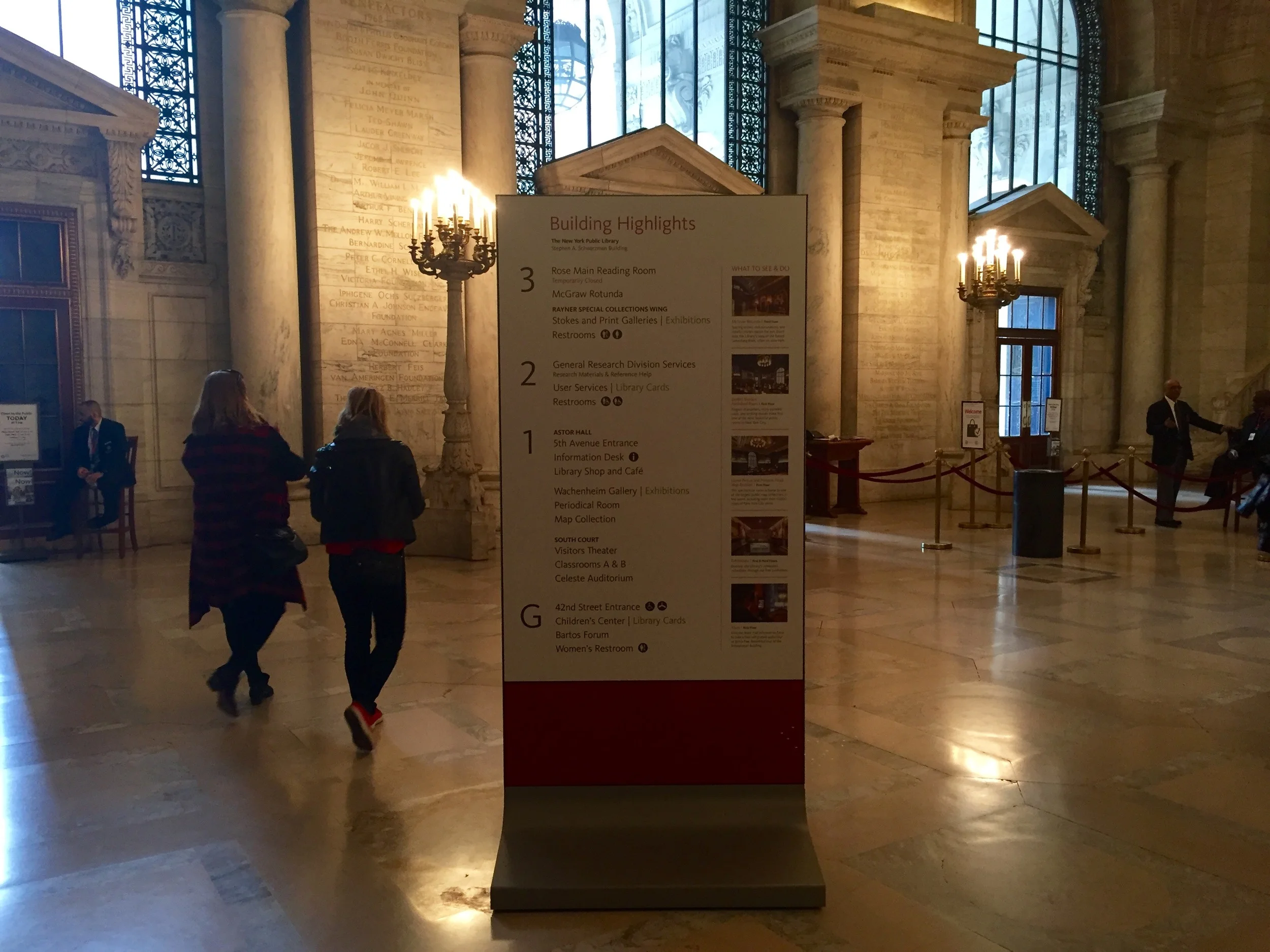
We noticed that current signs, devices and brochures were complicated. While there was a nice aesthetic to the signs, they were difficult to use. They were either too busy or too small to understand.
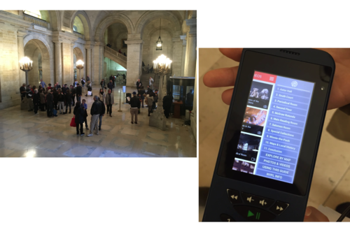
When exploring the library, we tried both the audio tour device and the guided tour. While both had a lot to offer, they were difficult to use. The guided tour was hard to hear and the device lacked clarity.
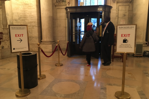
When exiting the library, the last touchpoint is the security line to check your bag. While we understand the need, we questioned how the experience could be improved.

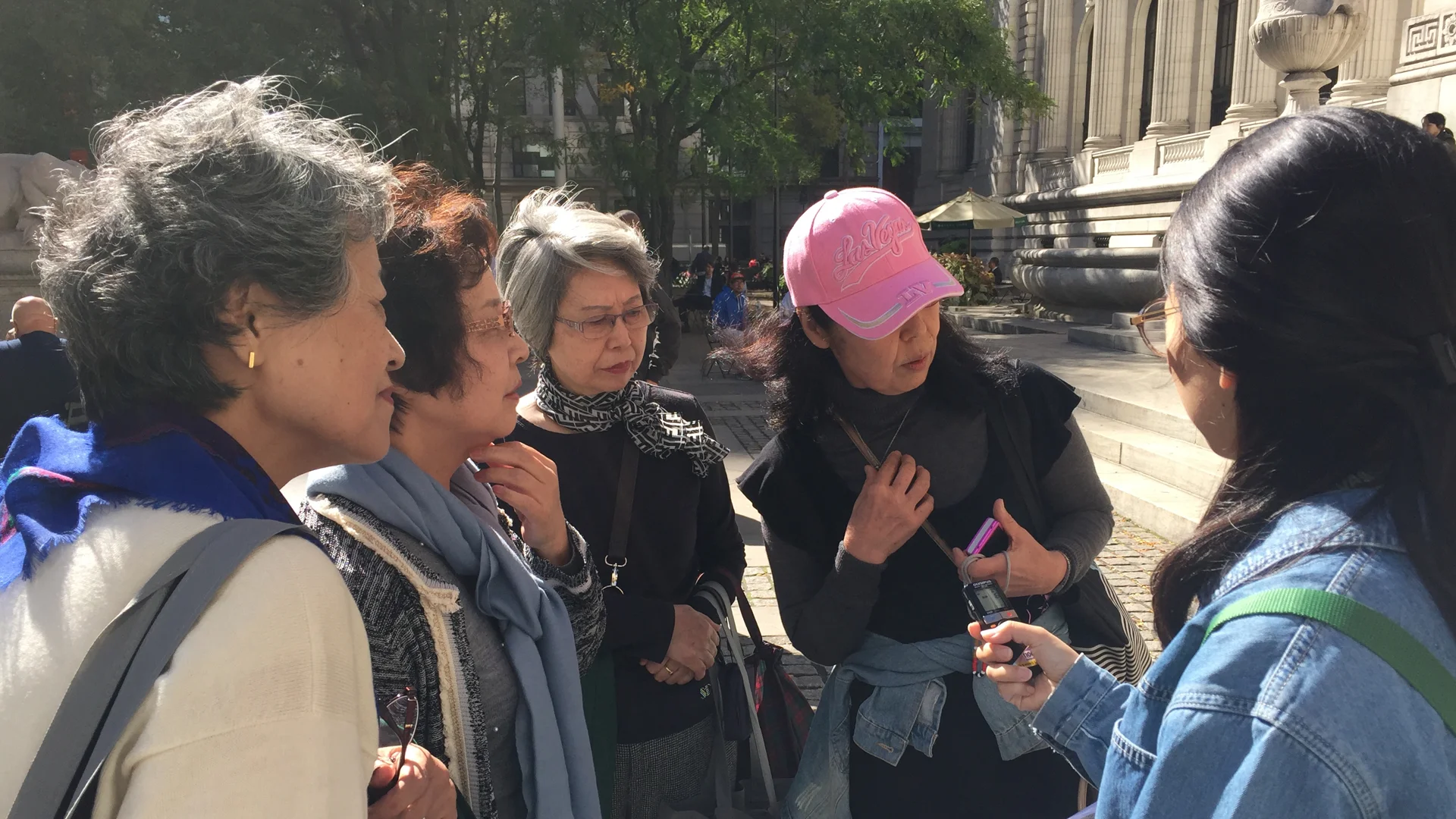
Interviews
We interviewed about 20 people. Most of the people were tourists and a few residents.
Insights
- “I didn’t even notice the information desk.”
Information desk is difficult to locate. When we interviewed tourists, we were able to reaffirm our own experience of the library. But one insight that we found was that many people didn’t even notice the information desk.
- “We went on the guided tour. It was good, but I didn’t really understand everything.”
Not enough international-friendly tools. We also discovered that international visitors had a hard time using the devices and guided tour. Because there are limited languages, not everyone can fully understand the history or culture described.
- “Where are the books?”
Way finding is difficult. There was also this repeating question: Where are the books? Many people come here to see the a large collection of books, but they don’t realize that they’re actually at the mid Manhattan Library.
- “We sometimes run out of devices or brochures.”
Resources are limited. We also found that resources are limited - there aren’t enough maps or listening devices. This actually happened during our own visit…
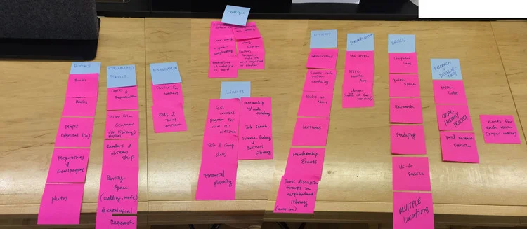
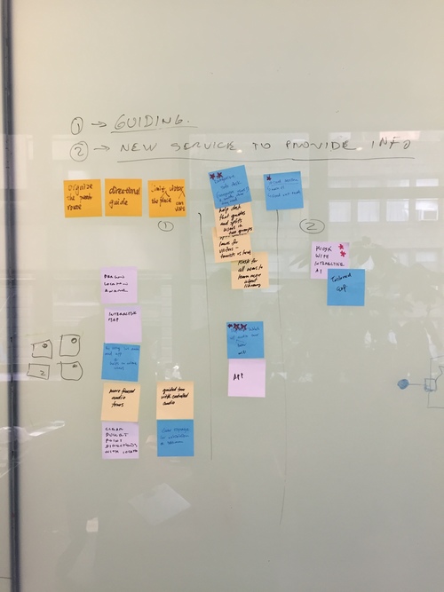
Brainstorming
Base on the research we did before. Our group start to do the brainstorm and draw the storyboard and site map.
Goal
- Create a clear centralized point of contact
- Provide an accessible tool for navigating through the library
- Complement the visitors’ journeys with an improved exit experience
Concept
We aim to create an inviting service that guides and orients visitors through the library for a more meaningful experience.
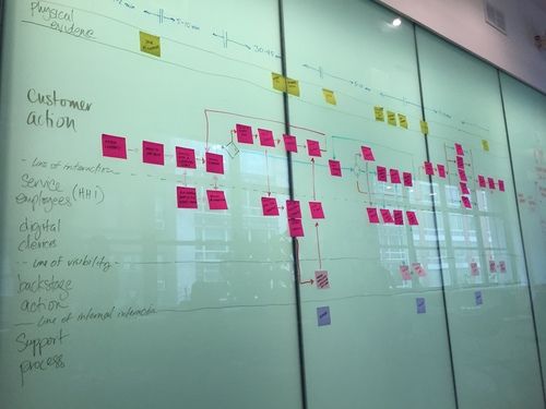
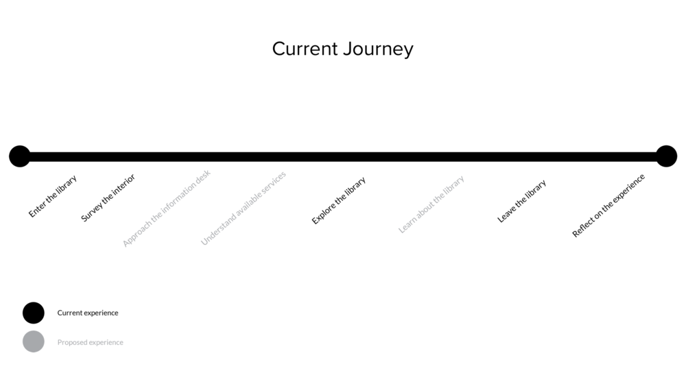
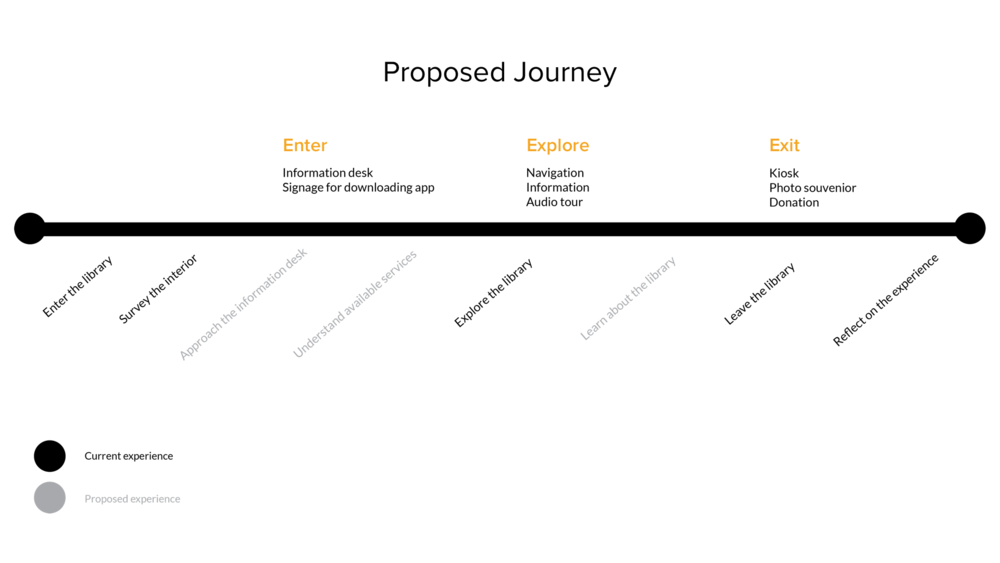
Journey Map
NYPL App
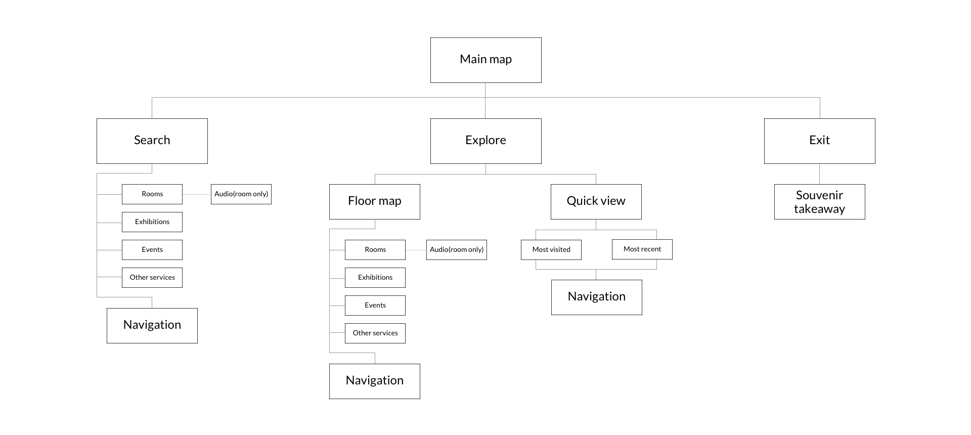
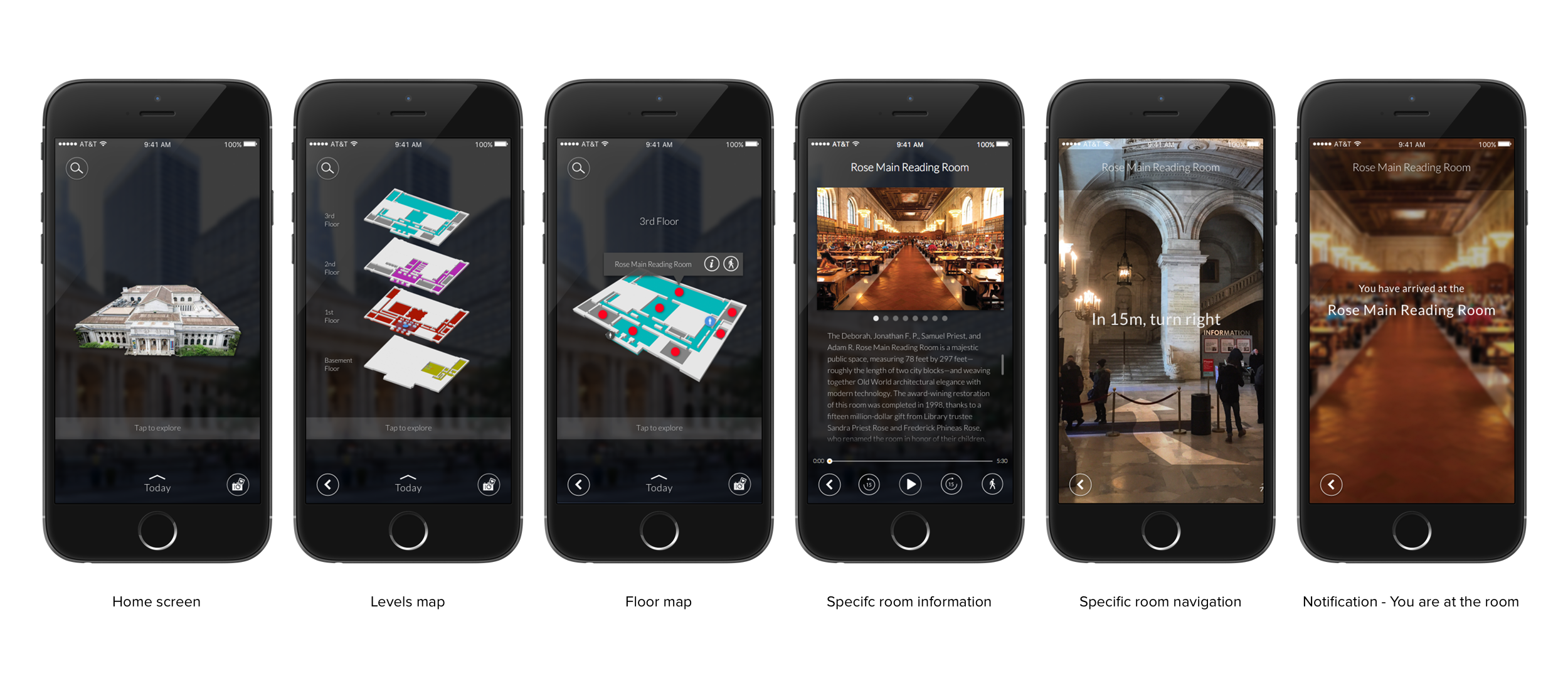
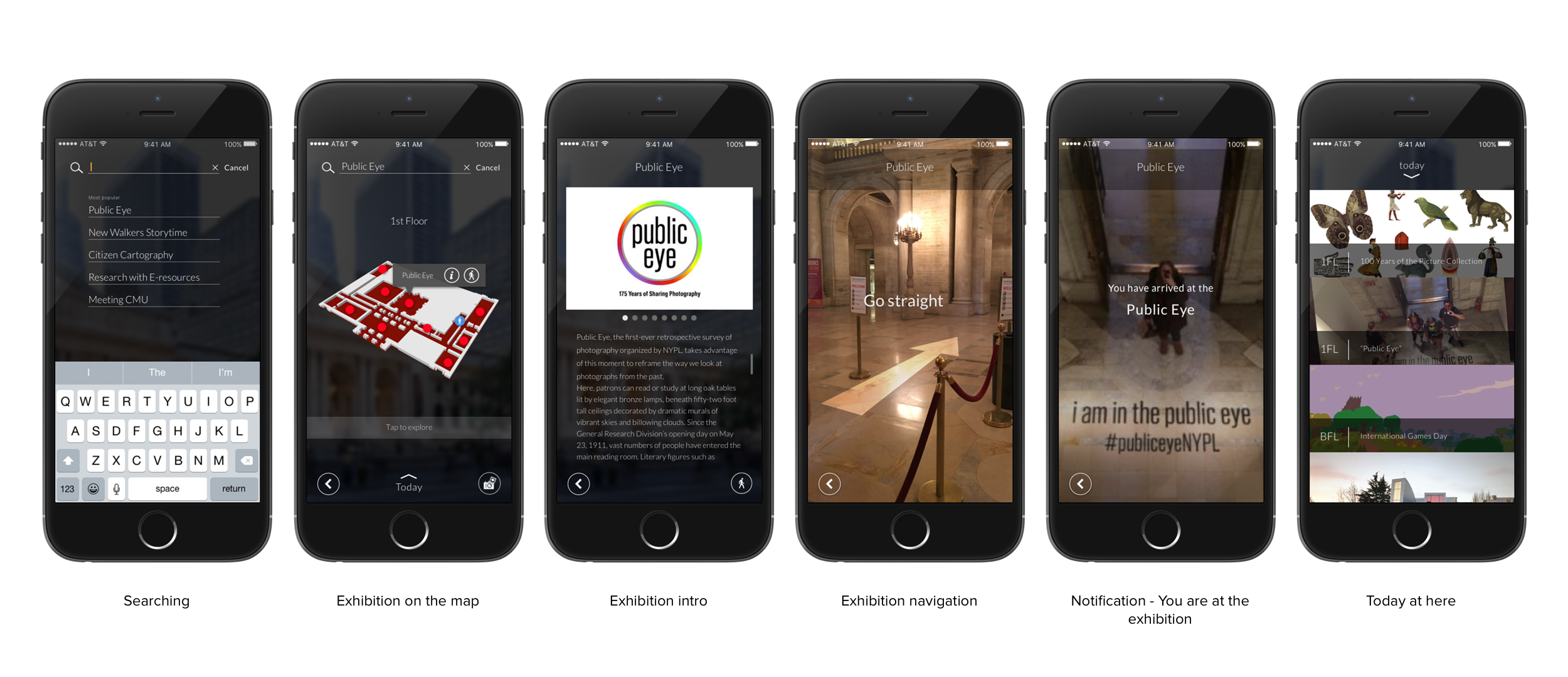
We decided to first tackle the most significant problems around way finding and accessibility. We thought of many ways to solve for it with signage, but we wanted to preserve the architecture and physical space of the library as best as possible. And we found the app to be the most discreet, yet useful solution. The app would also solve the problem of not having enough devices or multiple language devices.
Exploring the Library
- How might we provide more resources for exploring?
- How might we expand the languages offered?
- How might we guide visitors through the library?
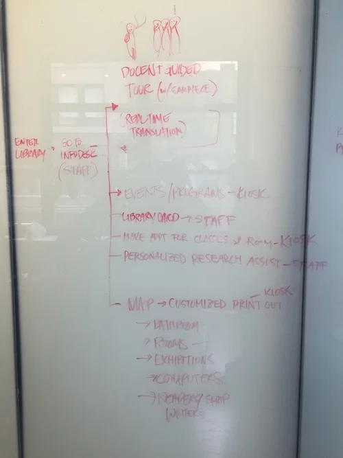
Site Map
Initial Wireframes
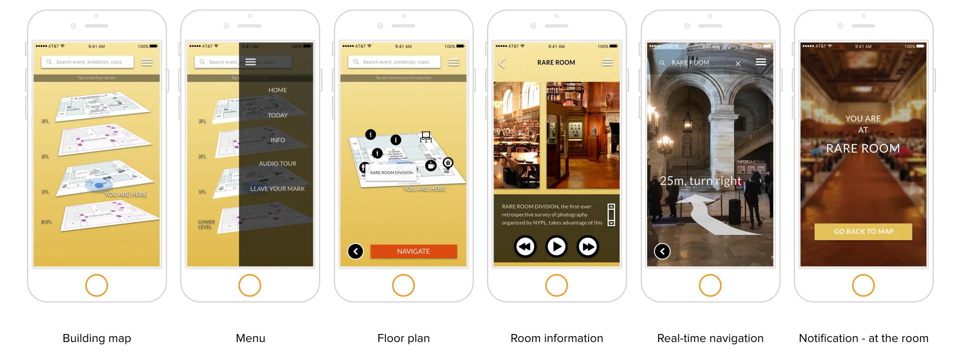
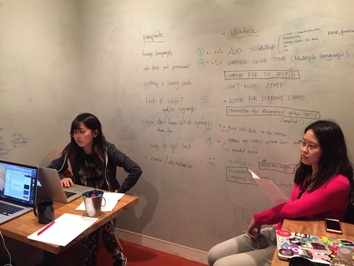
Testing
We discovered some problems with the prototype.
- The labels were confusing. We needed to label floors and identify journeys for key elements.
- There was also a desire to interact with the map. Users often tried to zoom in and rotate. They also complained that they couldn’t read anything.
- The Compass Icon was not clear to users. Even though some understood the symbol, they didn’t think it was tappable or thought that was the end of the journey.
Final Deliverables
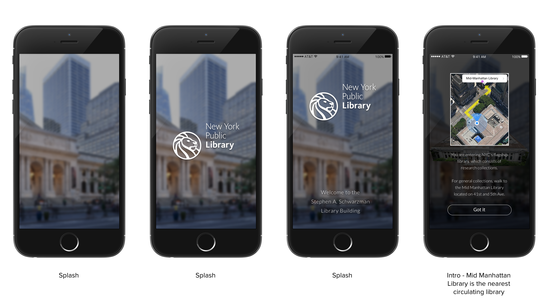
App Prototype
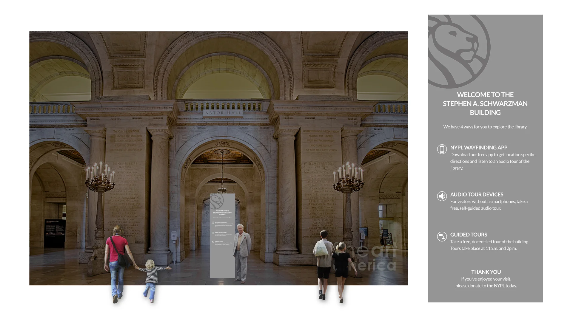
Entering the Library
We propose a simple sign at all entries. They will indicate what the library offers for visitors. At quick glance, they can see how they can explore the library. In addition, there will still be library staff to assist people in immediate searches and emergencies.
How might we create a clear entry touchpoint?
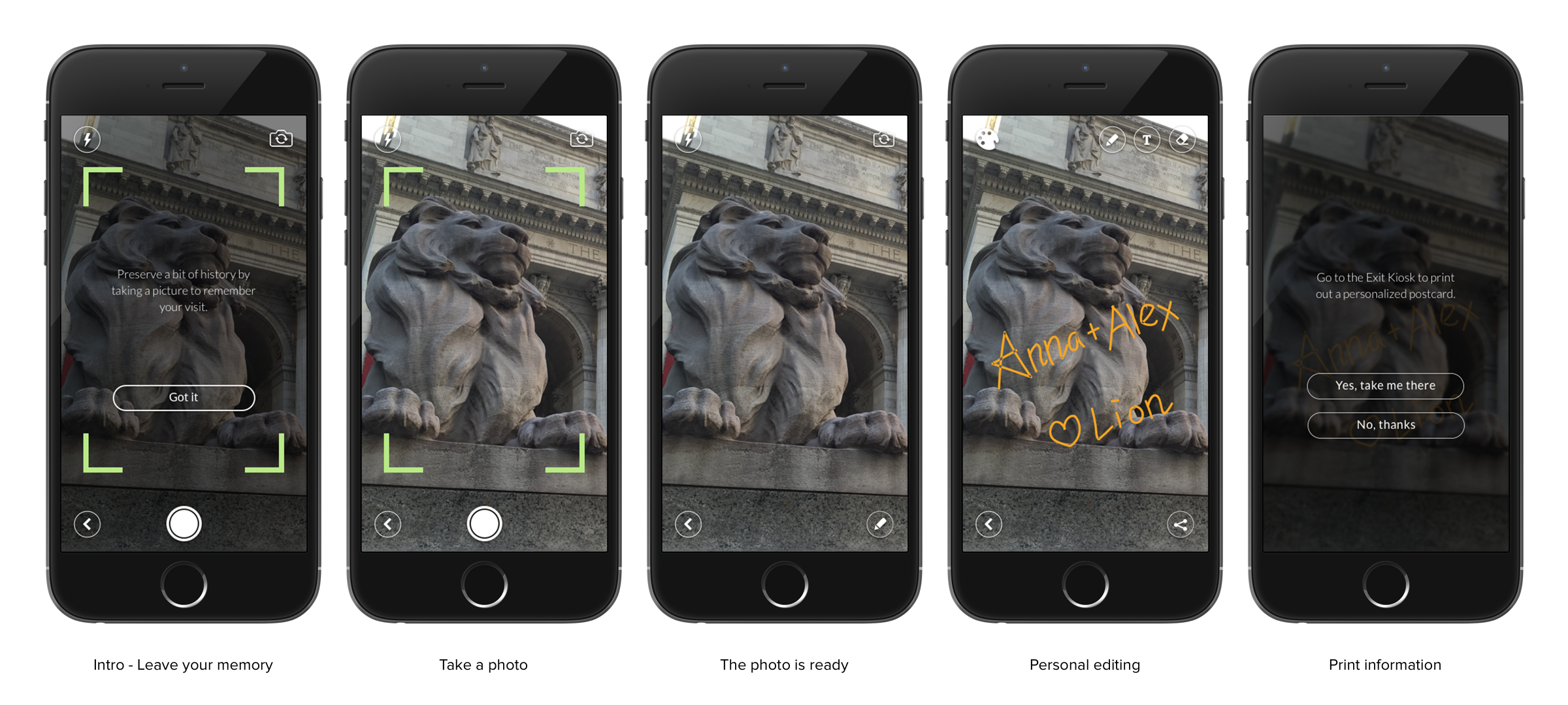
Exiting the Library
We wanted people to feel like they could help the library and at the same time, keep a memory of their experience. We did several design iterations, but we thought that the app would be the most accessible integration.
How might we improve the exit experience?
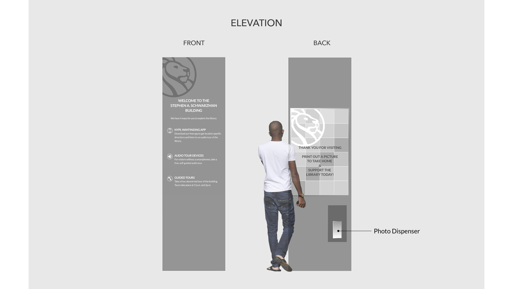
The exit kiosk would be located where people enter. Behind the entry sign, there would be a screen where you can print a souvenir postcard to take home.
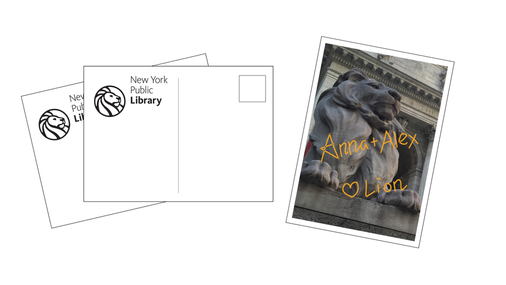
The postcard would be a simple souvenir that people can take home if their a resident or send to friends and family if they’re a tourist.
Current NYPL
NYPL improved their service design system by combining our design proposal.